
AirBrush Stamp
Overview
Role
UX Design, Visual Design, Usability Testing, QA
Context
Mobile devices have become increasingly important as more and more creators now prefer to edit and produce content on the go. Photo editing apps need to be comprehensive and powerful, yet still elegant and easy to learn, serving as an all-in-one app for users who want to edit quickly and painlessly.
The desired end result for the Stamp feature was to offer users an intuitive way to “stamp out” unwanted parts of their picture by letting them choose to replace it with another existing part of the photo. The challenge was in giving this complex idea a simple, friendly interface and interaction style suitable for a mobile app.
To comply with my non-disclosure agreement, I have omitted parts of the design process in this case study, including prototype screens and research results.
Why was “Stamp” needed?
The Stamp feature for AirBrush was an important addition in making AirBrush not only more competitive, but also more holistic. Multiple contextual inquiry sessions were conducted to learn more about typical users’ mobile photo editing workflow and needs--the most common painpoint: wanting a one-stop shop rather than needing to go to 3 or 4 apps just to edit and export one photo.
Prototyping a new Interaction
After several rounds of discussion with PMs and other stakeholders, I decided that the best way to go about this feature’s user flow was to separate it into two distinct steps that users go between freely:
1. Allow the user to select the area they want to stamp over, giving them tools to readjust the selection before confirming.
2. Prompt the user to select the stamp source area, which will be applied over the area selected in step 1 when the user confirms.
The issue was that since none of the pre-existing features included a similar 2-step process, there was no precedent to model Stamp after. This raised the question: how should the interaction flow be designed so that users can incorporate it into their existing mental model seamlessly? I first started with sketching out wireframes to test out potential interaction styles, focusing specifically on the interaction that would take users from step 1 to step 2.
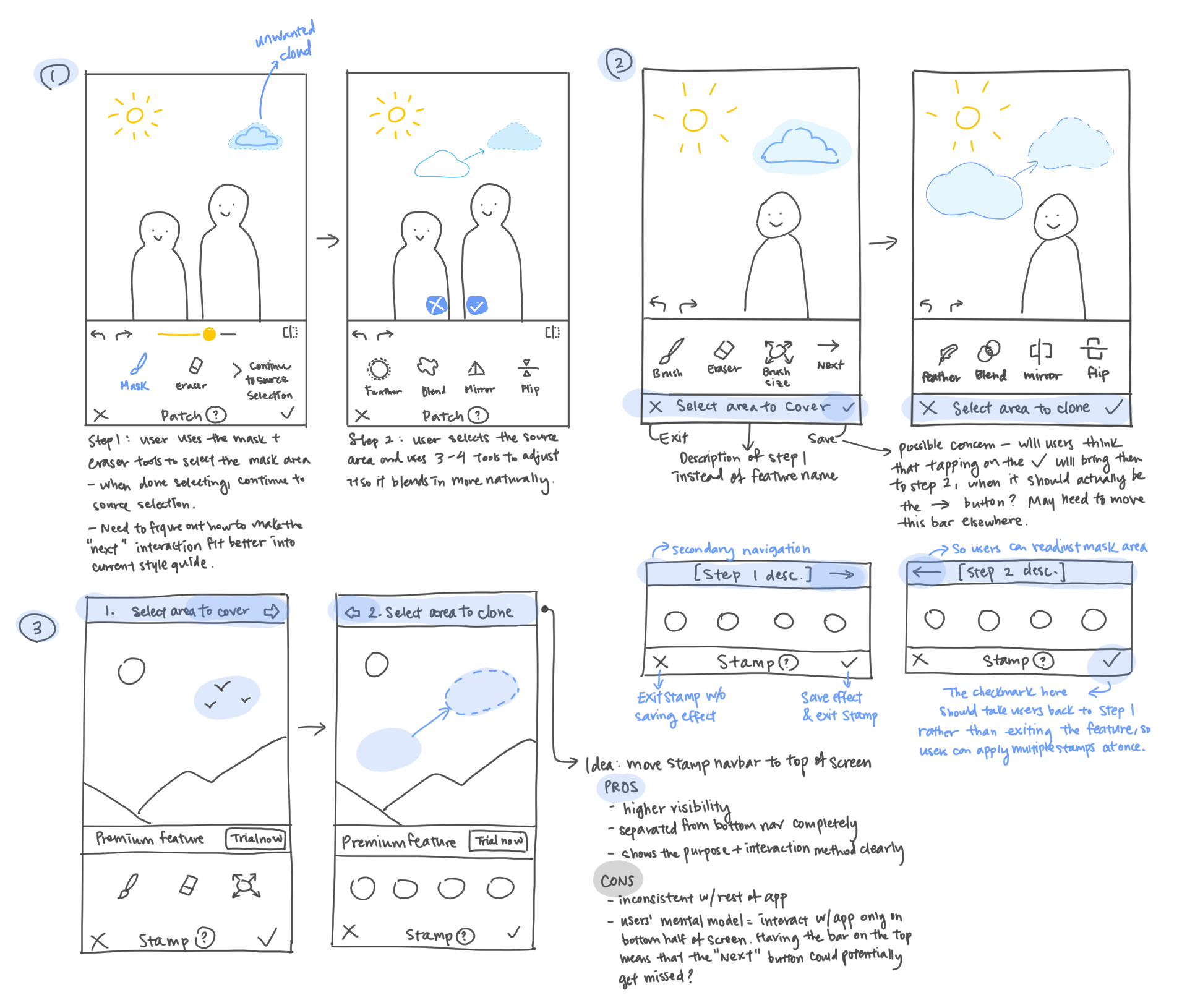
At this point, I created medium fidelity screens for the Stamp feature, but still had my doubts about whether users would be able to understand how to navigate between the two steps, in addition to still being able to save and exit the feature without any issue. I conducted two rounds of usability testing using these screens, adjusting the design and copy according to the insights I gathered from the test results. By the end of the second test, I managed to decrease the number of users who felt confusion over the interaction by more than 50%.
It was important that the navigation interaction between the two steps was separate from the bottom navigation used for saving and exiting, so that the bottom nav bar could remain consistent in function across the app. To achieve this, a secondary navigation bar was proposed, specifically meant to help users navigate within Stamp. I then paired this with an additional tool tip cue, helping to guide users’ attention to the new secondary navigation bar.

Iterating and Improving
Design is a continuous process, each iteration an improvement compared to the one before. After launch, we paid close attention to user feedback on Stamp, and used it to inform the decision to add a minor animation in step 2. This addition was used to signify the affordances and possible interactions on this screen, and helped to increase the usability of the feature as a whole.
Impact
A record-breaking $3M revenue the month after it was released
A 17% increase in user acquisition 2 months after it was released
Ranked 5th in feature-driven conversion rate within 1 month of release
Learnings
Aside from the challenge of the interaction design for this feature, another challenge was in balancing the needs of the different stakeholders and keeping everyone on the same page for this project. The PMs, Growth Team, and Engineers had very different concerns and needs; as the product designer, I learned how to consider and empathize with these different perspectives, while still keeping the user at the center of my design process.